

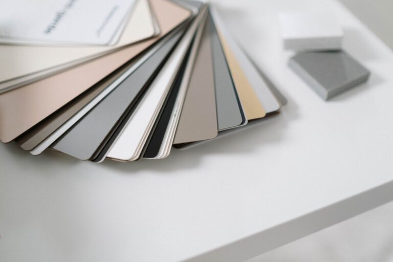
Creating a peaceful and relaxing environment in your home starts with the colors you choose. Calm colors can transform any space, making it feel serene and inviting. Whether you’re repainting a room or redecorating, choosing the right hues is essential for setting the mood. Here are some helpful tips to select calm colors that bring balance and tranquility to your living spaces.
Why Choose Calm Colors?
Calm colors, often found in soft blues, greens, neutrals, and muted pastels, have a soothing effect on the mind and body. They reduce stress and promote relaxation, making them ideal for bedrooms, living rooms, and any area meant for unwinding. Unlike bright or intense colors, calm tones create a comfortable atmosphere without overwhelming the senses.
Understand the Basics of Color Psychology
Before selecting colors, it’s useful to know how different hues affect emotions:
– Blue: Often associated with calmness and peace, blue tones can lower heart rates and create a sense of stability.
– Green: Evokes nature and renewal, making spaces feel fresh and balanced.
– Neutrals: Colors like beige, taupe, and soft gray bring warmth and simplicity without distraction.
– Pastels: Light pinks, lavenders, and peaches add softness and subtle cheerfulness.
Knowing these basic associations helps in choosing colors that align with the mood you want for your home.
Tips for Choosing Calm Colors for Your Home
1. Start with a Neutral Base
Using neutral colors as a base creates a versatile and calming backdrop. Shades like off-white, light gray, or warm beige are easy on the eyes and pair well with almost any accent color. This approach allows flexibility if you want to add pops of color later without overwhelming the space.
2. Consider the Natural Light in Your Room
Lighting dramatically affects how colors appear. Rooms with plenty of natural light can handle cooler colors like soft blues and greens, which accentuate the brightness. In contrast, spaces with less sunlight might benefit from warmer neutrals or gentle pastel hues to keep the room feeling cozy and inviting.
3. Choose Muted Tones Over Bright Ones
Vibrant colors can energize, but muted tones have a calming effect that lasts longer. Look for colors described as “dusty,” “soft,” or “muted” rather than bold or saturated. These gentler shades help in creating a peaceful ambiance and prevent visual overstimulation.
4. Use Color Samples and Test Patches
Paint colors often look different on a large wall compared to a small sample. Before committing, test your preferred colors by painting patches on the walls. Observe how they change throughout the day under different lighting conditions. This step is essential to ensure the color Truly feels calm to you.
5. Balance Colors with Texture and Materials
Calm colors don’t have to mean boring rooms. Combine your chosen hues with various textures like soft fabrics, wood finishes, or woven baskets to add interest. These elements complement calm colors and create inviting, layered spaces.
6. Limit Your Color Palette
To maintain a restful environment, avoid using too many different colors in one room. Stick to 2–3 calm colors to create harmony. For example, pair a soft green wall color with neutral furniture and a pale blue rug for subtle contrast without chaos.
7. Bring in Nature-Inspired Shades
Colors inspired by natural elements such as the sky, ocean, stones, and foliage are inherently calming. Blues, greens, and earthy browns connect your indoor space with the outdoors, fostering a relaxing vibe. Consider these palettes when choosing paint, textiles, or accessories.
8. Use White and Off-White for Breathability
White and off-white tones brighten spaces and provide a clean, fresh feel. These colors serve as a perfect backdrop for other calm colors and make rooms feel open and airy. Be mindful of undertones—some whites have warm or cool hints that can affect the room’s mood.
9. Think About the Room’s Purpose
The function of each room impacts which calm colors work best:
– Bedroom: Soft blues and lavender promote rest and tranquility.
– Living Room: Warm neutrals with hints of green encourage relaxation and socializing.
– Bathroom: Crisp whites and pale greens create a refreshing, spa-like feel.
– Office: Muted blues or grays help focus without stress.
Tailor your color choices to support the activities and atmosphere you want in each space.
Common Calm Color Combinations
Here are a few peaceful palettes to consider:
– Blue and Gray: Soft sky blue walls with light gray furniture.
– Green and Beige: Sage green accents paired with warm beige tones.
– Lavender and White: Light lavender walls combined with crisp white trim.
– Soft Pink and Taupe: Dusty pink decor with neutral taupe furnishings.
Experiment with combinations to find what feels most soothing to you.
Final Thoughts
Choosing calm colors for your home is a wonderful way to create a sanctuary from the busyness of daily life. By starting with a neutral base, considering natural light, and testing colors carefully, you can select hues that promote peace and comfort. Remember to balance colors with texture and limit your palette for a cohesive look. Whether you prefer soft blues, gentle greens, or warm neutrals, calm colors invite relaxation and happiness into your living space.
Take your time exploring different options, and most importantly, choose colors that make you feel at ease in your home. Happy decorating!